Under the dashboards components charting section you might find the Circle Gauge component (see picture below).
By default this component values follows as (see picture below):
- Min Gauge Value = 0
- Max Gauge Value = 100
- Yellow Boundary Start = 70
- Orange Boundary Start = 80
- Red Boundary Start = 90

-------------------------------------------------------------------------------------------------------------------------------------------
You have full control of these values and they can be easy changed with component editor (see picture below)
Note: Min value can not be bigger that max value. Boundary values should be in range between min and max value and yellow boundary can not be bigger than orange, and orange boundary value can not be bigger that red.

Result (see picture below):

-------------------------------------------------------------------------------------------------------------------------------------------
You are able to swap red and yellow gauge fields by selecting swap function from component editor (see picture below)

Result (see picture below):

-------------------------------------------------------------------------------------------------------------------------------------------
Note: It will not mirror the component, it will only swap colors (see picture below):


-------------------------------------------------------------------------------------------------------------------------------------------
In order to mirror the gauge you will need to swap yellow and red fields, and set yellow boundary value the same as min gauge value (see editor example below)
Note: if you swap the colors and set yellow boundary value same as min the grey gauge portion will be hidden.

Result (see picture below):
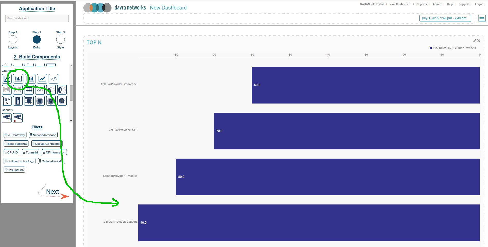
 The bar chart component is a simple component that's very useful for visualizing your sensor data when that data is arranged in groups. In the example below the RSSI value of a cellular connection is broken out by cellular provider and ranked by best to worst. The data gathered bar chart component is implicitly ranked giving rise to its other name the "Top N" component.
Configuration
To configure the bar chart you need to select the sensor (metric) and the Group By field. The group by field is what gives us the different bars, without choosing a group by field you will get one bar - the default group for all data points. The "Top" field limits the number of bars shown, when the server groups and ranks the data it takes only the first (top) results up to the specified number here.
